2 Design Options for my Home Office
The High Pony Hair Tutorial
In my previous home my office was on the third floor and it just so happens that we have a very similar layout at our new house that allows me to have my office on the third floor again! It is definitely much more space than I need, but it works very well because I’m separated from the rest of the house and it’s actually quiet enough for me to be quite productive!
The space I’m in now is more rectangular in shape than my old space, but it has the same half wall situation that my past office had as well. If this room wasn’t finished it would be attic space and the half wall exists to provide space for HVAC ducting.
It helped me immensely to ask Modsy to give me a few design options for my office so naturally, I did the same thing when we moved to the new house!
I explained that I needed a space for my desk (and it was likely going to stay in the same spot that I currently have it) and then a filming area for video, as well as a few other styled spots for filming or photos. I checked a few boxes on their questionnaire to explain my style preference and they really nailed it. I already have a favorite but I’d love to hear which design style you like best!
Office Design Option One
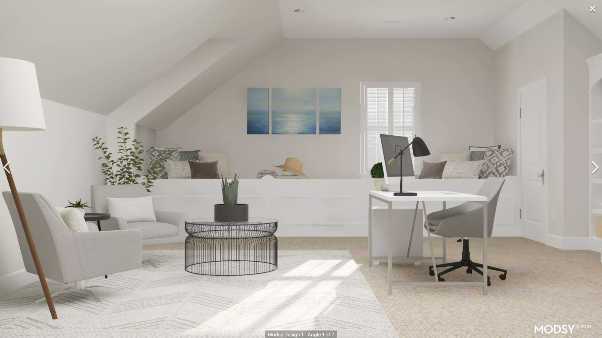
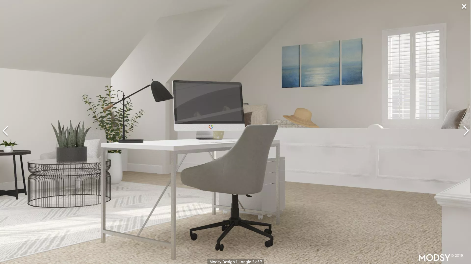
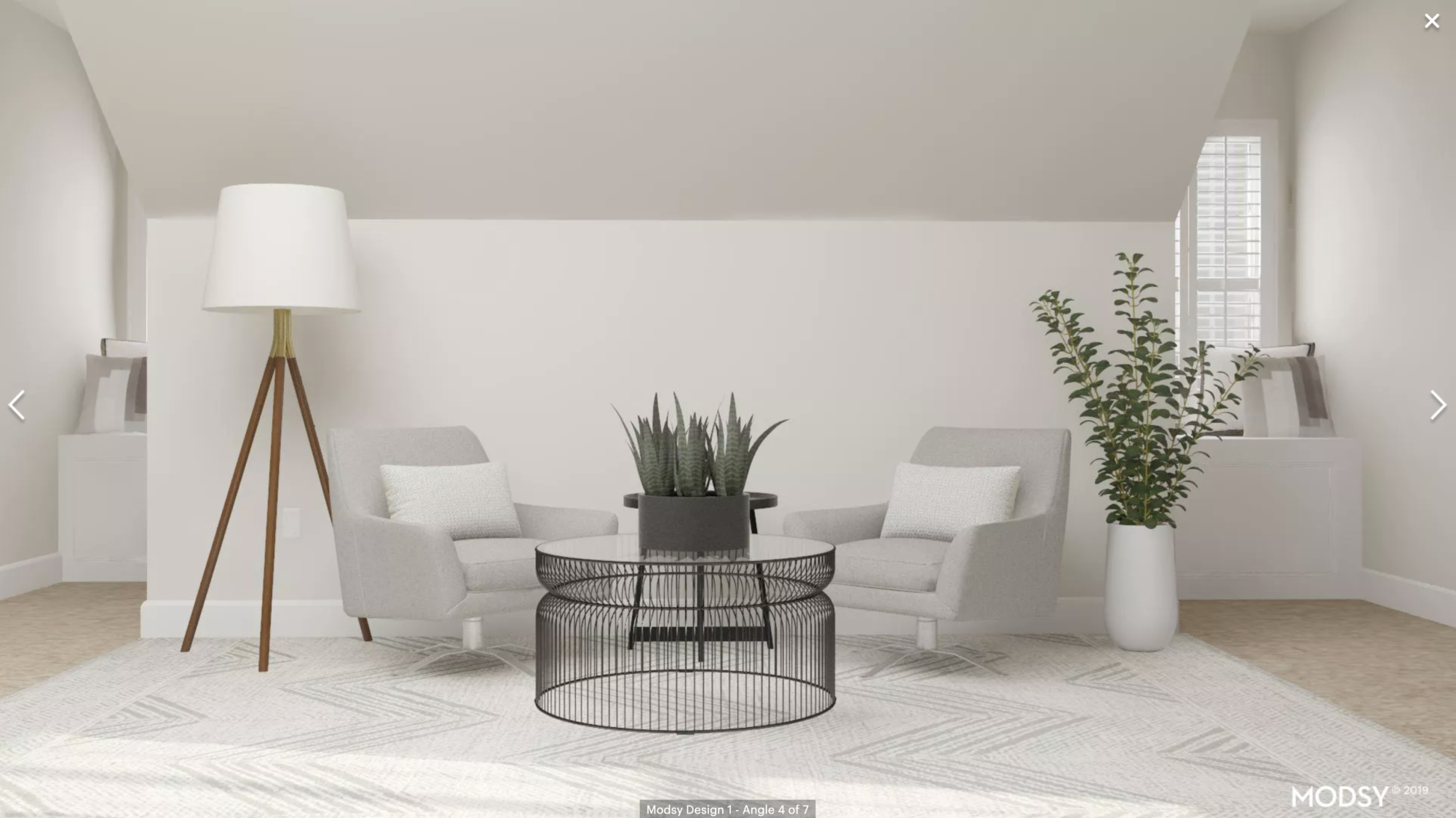
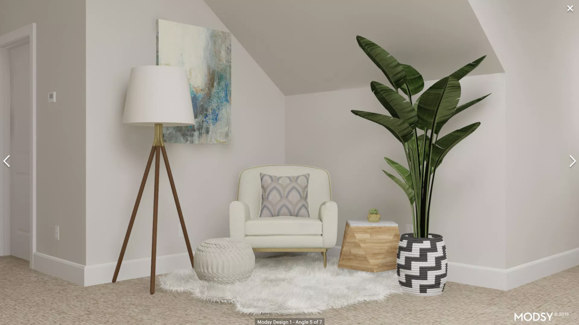
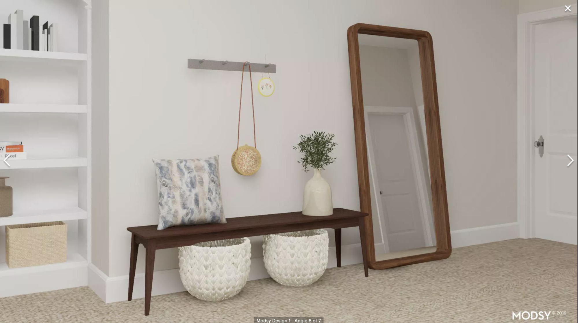
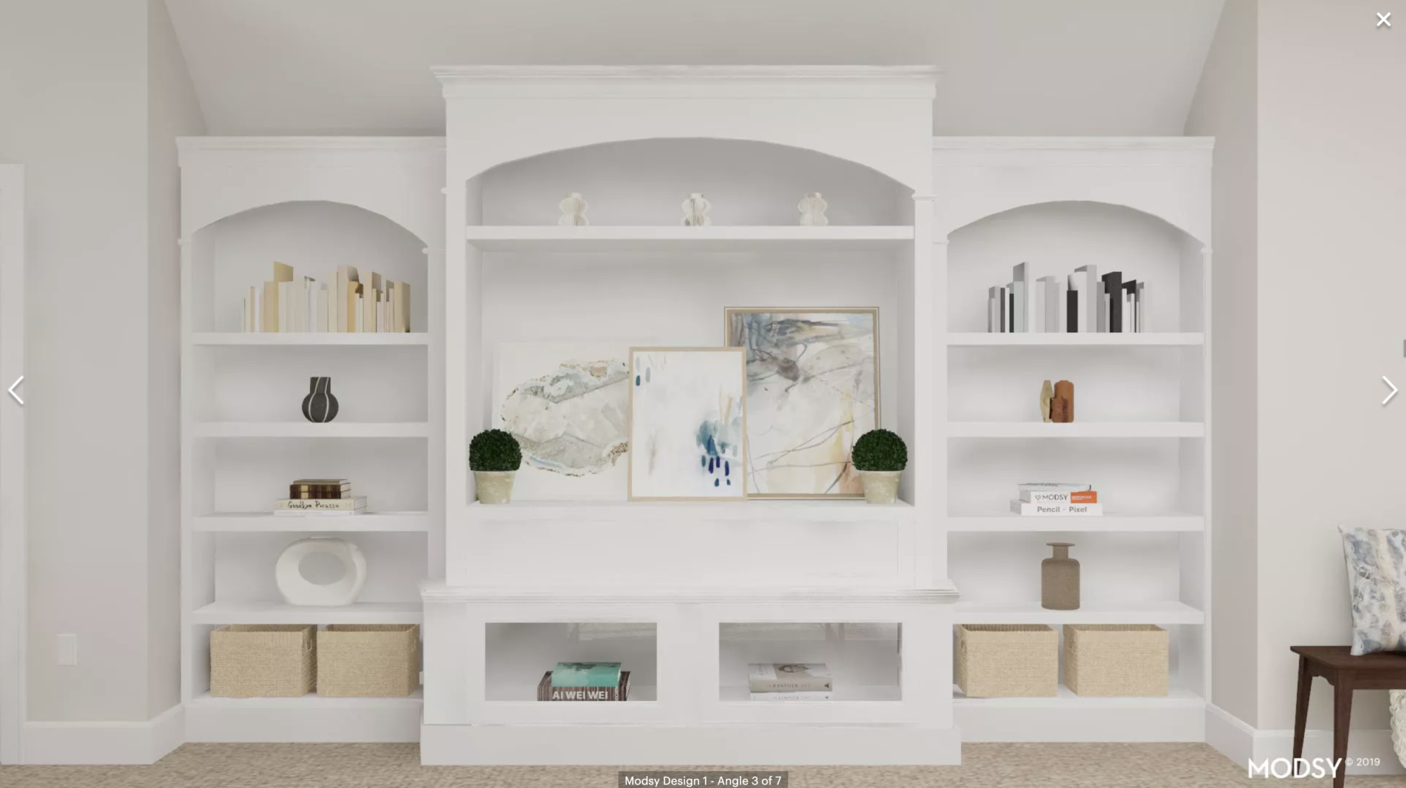
Isn’t it absolutely beautiful? I love this design! It feels so light and fresh, and a bit California inspired as well. I really like the variety of filming areas and the cute set up with the mirror.
Office Design Option Two
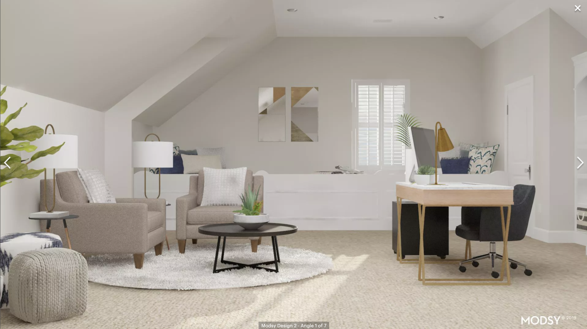
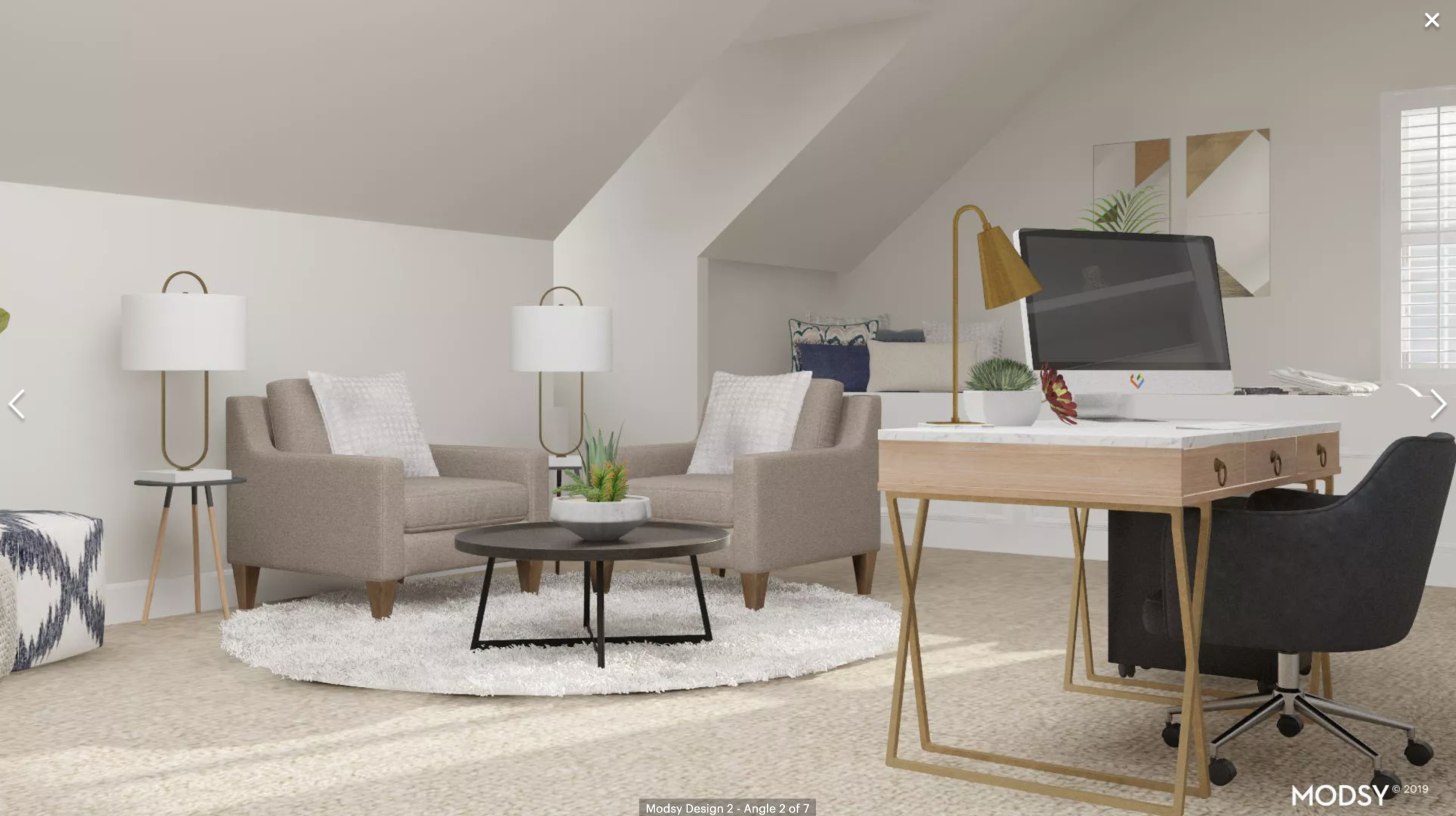
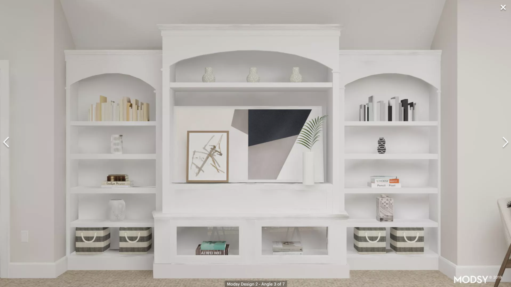
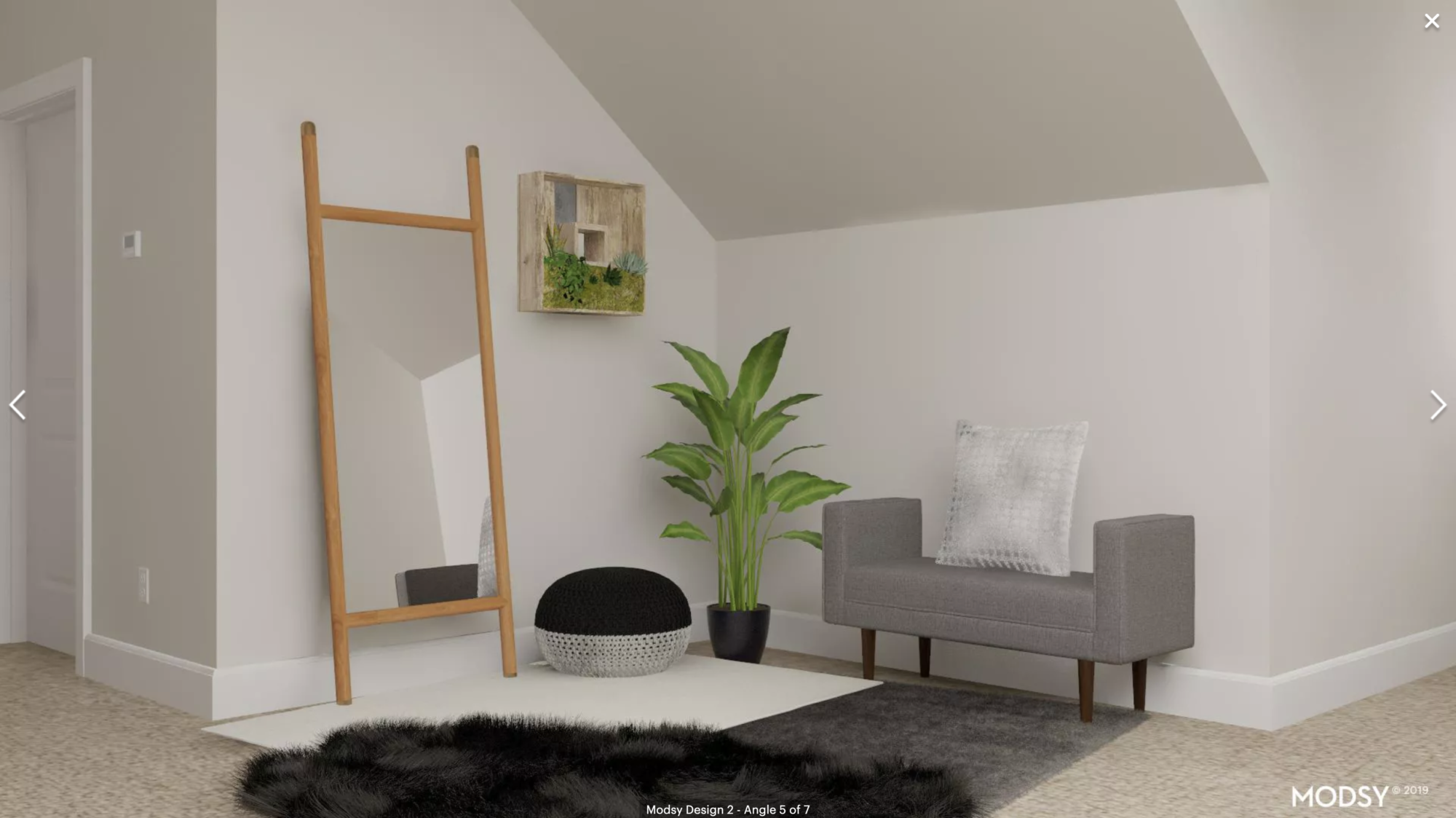
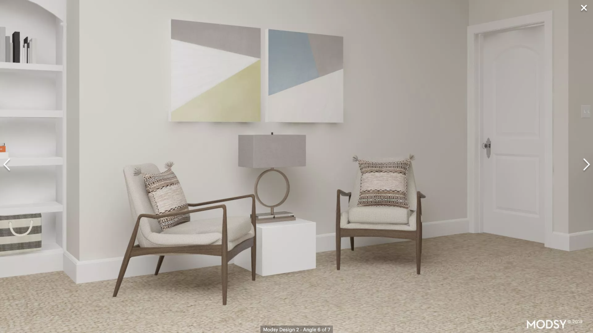
This design feels a bit more minimal and modern than the first one, to me, but I still think it’s very pretty. I love this last area with the two chairs angled towards each other as a conversation area. And I really like the art selection in the built in’s behind the desk as well!
So, between both designs (which aren’t extremely different, I know) which is your favorite? (photos are screenshots of the Modsy designs I purchased)
P.S. Curious about my old office? Read this post! You can also read about my experience with Modsy in designing our downstairs family area at the old house here!

comments
Option 1
I prefer design one since it’s a little less modern.
Also, on the hair front, I’d love to see you review the Voloom!
Oh wow, I love both the potential designs – though I think I prefer the first one! I think it’s because of the painting of the sea, which gives me a sense of calm… blue is a great colour on white! 😀
Charmaine Ng | Architecture & Lifestyle Blog
http://charmainenyw.com
Design 1 seems more like you!
I like option 2, with the art work from option 1! Option 2 feels more homely to me, but still an office.
I like the color scheme better in the first one. It looks like such a peaceful place to work!
Design #1 is my favorite!
Design one, for sure!
Does that mean you don’t have air conditioning in this house?
She has air conditioning. The half wall is what contains the ductwork for the heat and AC
Thanks! Totally not how I read it at first, but now I see it.
I really like option 2, maybe it is the furniture for me. Personally, I don’t love swivel chairs in seating areas since I am a fidgeter and can’t resist swiveling. I also love the two chairs on the last picture for a space to sit and talk.
Both are certainly beautiful! I think ultimately I prefer the first one. It seems to fit the style I’ve seen in your instagram stories and photos more. There’s both gorgeous designs though. Tough call! I really need to try this Modsy tool for my home office. Decorating it has been a struggle!
I really like the 2nd option better but I like the white furry rug and the potted plant with the gray/white bucket in the first picture better than the options in the 2nd. Does that make sense?
Design 1 for sure!!
Design 1 for sure! Beautiful and functional!
First one
Design 1! For sure
Love them both but number one for sure!
I like design 1. It feels more you. What a cool service though! Good luck!
I prefer option 1!
Love number 1!
I’m shocked that I like the first option better, because the second is more my style. For that space, the light and airy feel just works. Either way, it’ll be beautiful!
K A T E L A T E L Y || fashion & lifestyle blog
http://www.katelately.co
Option One is my favorite. It’s elegant, light and airy, sophisticated and timeless. That said, I believe either one would be an enjoyable place to work.
I like a mashup–all of the art and accoutrements from option two, with the white chairs and desk from option one. Love that modern minimal look!
Both lovely but I prefer option one.
Both are pretty but I favor option one .
You should def order art from Lindsay Letters art co!!! Love modsy, have used them twice, but their art suggestions are just ok.
I love design one! It’s a beautiful, fresh feel!
I love the first option and it seems more like you!
Both Modsy options are great. Overall, I like option #1 the best, but I prefer the chairs in #2–the tans once with four legs versus the grey ones with the single chrome swivel leg. What fun! How lucky are you to decorate such a great space!
I love the first option!
Overall preferring g option number 1 but the desk area in option 2 is much prettier.
Number 1 is my vote! Both are beautiful!
Option 1 for sure!
I feel like option one looks more like you and your taste…..but also immediately liked the built ins behind the desk in option two better. Overall I prefer option one. No matter what you decide on, it will look great.
I see a lot of votes for design one… but I was drawn to the second one… either one will be beautiful! Enjoy your new space whatever you decide!
Option 1 is my favorite! Very open and airy feeling.
I prefer the first design. Seems to be more functional with multiple spaces that can be used for multiple things.
I like the first design the best with the second designs non swivel chairs better! And I also like the second designs corner nook better than the firsts! You can’t ever have too many mirrors! Lol! Good luck! Both look beautiful!
Something about design 1 really speaks to me. I love the ocean pics and the lighter vibe.
Like design 1 better; however, I like the shelves on the 2nd one better.
Option number 2! The first one is pretty, but boring to me.
I prefer option one! Love how you can actually see how the room will look with Modsy.
Oh, man i like parts of both of them. I like the desk and all the chairs from the second one and the brightness on the build-ins and the bench wall on the first one. Well that probably wasn’t helpful haha.
Definitely #1
The first one feels way more like you, in my opinion. It feels light and feminine while I feel like the second one feels more masculine and modern, too harsh.
I like everything about the first one, but I also like the mirror area of the second one, with the dark rug!
Design 1, for sure.
I like the desk in option 2, but the design and layout of option 1.
I like for option one , seems more warm and inviting and of course the chairs look comfortable, if it was a regular office well yeah stylish but when you have a home office you need to have the comfort , the feel of your home reflected in your work space. It’s my opinion and hope it helps you decide , best of luck
I love number one!
It took me a minute to realize why, but I like design 1 best. The furniture in design 2 seems to “weigh the room down” with bulkiness. I like the light and airy feel of design 1. think it promotes more creativity!
Option 1
The first one
I like the first one.
I’m digging the second design. I love the simplicity of it. I love the coffee table, however I LOVE THE MIRROR in the first design.
Overall I like style one the best. Although I like different parts of both of them. So much seating!!
Loving the first option the most!
I love both designs but I think the first option is more “you.” 😊
I love the first one! It’s less modern than the second, and I like the set up of the different areas throughout the room for filming, photos, etc.
Option one seems more your taste!
I really like parts of each. I like the second one but with the first option desk. I also think the bench would be uncomfortable and would replace it with a chair or something else. But the overall design I like the second one better.
I would say design one is the better of the two, but honestly I think both designs seem a bit jarring being placed in such a traditional, southern home. I thought you wanted to do more of a Coastal Carolina/Southern inspired feel in this home?
How do you make the desk work in the middle of the room? Because you need cords to plug in computers and electronics. Do you have cords lying around?
Both designs are very beautiful though!
Design one!
Option 1 feels more aligned with the aesthetic I’ve come to expect from your blog, videos and social media presence.
I love both! I do favor the little nook space in option 1 with a rug and chair to read.It looks more cozy, but love option 2 overall space and placing of furniture.
Love option 1.
They are both very nice, but I like the first option best.
I like the first one!
I love number 1!
I love love love the first design!! Such a cool service and seems like it has consistently been super helpful for your spaces. Thanks for sharing your experience with the company. 🙂
I love them both. They both fit in well with your home decor/style. But I think option number 1 seems a little more you. Love it, love the neutral color scheme, and the different filming areas, the mirror area. I really like the furniture more in option 1 as well. Great choices either way!
I love the second option! I am currently looking for a desk like the one featured in design 2, and I also love the chair. The gold legs of the desk and the velvety office chair make the room feel sumptuous, but the two more modern looking chairs and triangle artwork help keep it spacious and airy.
I like both, but I marginally like the 1st one better.
I prefer the first one but elements of the second one. I love the desk and the round rug in the second one. I also like the baskets used in the bookshelf on the second one. For the first one I love the area with the bench. It is so adorable!
Design 1 looks so much cleaner and not so busy! Very pleasing to the eye and would be a calming work place!
I like option 1
Option 1
I like One better
I vote option 1.
Option 1 is definitely my favorite! Now I’m wishing I had a home office! 🙂
Definitely #1
I like design one, but I like the darker chair in design two!
Number two!
Design #2!
I like design #1 the best!
Both options are great – but I am loving option 1!
I like the overall design and space setup of design 1. The two “filming areas” make more sense to me and a better use of space. I do feel like there is a lack of color or blandness to the main office area and I think would prefer the chairs in design 2 for the area across from your desk. Both are really nice!
Design 1 overall, but I do like and probably prefer the built in styling better from 2.
Definitely #2!
I love option 1! As soon as I saw it, it reminded me of you!
Design 1 for sure! Can’t wait to see what you picked.
Option one is so beautiful 😍 I would go for that.
So light and airy
Option #1!!
I really like design #1
Option 1
Love the first one!
I vote Option One. Dreamy! (But I like the wooden chairs in Option Two vs. the bench in One.)
I prefer #1. It feels more warm and cozy to me, and the furniture looks more comfortable. What do you do with all the cords and plugs if the desk is in the middle of the room?
Design One is my favorite. Something just pulls me in and seems so inviting. The sitting areas and the area by the door for your bags and sweaters in case you need to store something there. A good spot for the mirror to.
Design Two is great just not as inviting to me for some reason. I think it is the wall art it isn’t as calming to me.
I love the first design
So fun! I love how light and airy the first one feels but love all the artwork in the 2nd one! Maybe you can meld the two together!
Love the first one!!!
Design 1 looks much more comfortable.
I love both, but the first design is what I would go for. It feels a lot calmer and gives a serene vibe to the office. So yeah. Let us know which one you actually picked!
They’re not so much different designs, just different pieces. I like the chairs in front of your desk better in Option 2, but I like the rest of Option 1 better. Can you tell Modsy you want a bit of both? Or just take it upon yourself to find pieces in store that are similar to their designs! I love the table your mom found that’s almost identical to the one in Option 1.
P.S. When do we get a tour of your new home? And a before/after of your old house exterior paint? Would love to see those!
Design 1 – definitely!
Love both these designs. I am just getting started on a Modsy project but am still an little hesitant. I have taken the Modsy style quiz but it doesn’t feel quite right. Just curious – out of the six preset modsy design styles, what was your office design – modern and minimal / rustic and warm/ traditional and comfy / urban and trendy / dramatic and bold?
THANKS
Option 1
Which one did you go with? I am currently making a home office for myself and would love to see.TIA!
Love this idea!! I was looking at the Modsy website, which did you use? The Classic, the Premium or the fancy Luxe package. I was going to give it a try, I am at a loss with the layout of our living room.
I like design 2! I love the more colorful scene. Too much gray in design 1.
Option 1 all the way!!! Just love it!! Really feels like you!