New Studio!
A Day in Naperville
I’m sure you all have had one of those days where everything happens. Some good, some not so good. . . but it all comes at once!
That was yesterday.
One of those things, which was a GREAT thing, was that I’m moving to a NEW studio to do hair! Yay! I’m elated.
This has been a long time coming as there have been a few issues at my current location. (If any of my current clients are reading this, don’t worry. You’ll be contacted soon with my new information)
So I’m moving to a beautiful location, only minutes from my current location. There are hard wood floors, dark wood cabinetry, a massive window (yay natural lighting!), and plenty of space. It is definitely an upgrade.
But–we need to paint. Big time. And redecorate. So I’m employing my hubby and my sister to help me get the job done! And I think I’m going to use my new stencil from Cutting Edge Stencils that I won from a giveaway on Hyphen Interiors blog. So excited to have a purpose for this so soon!
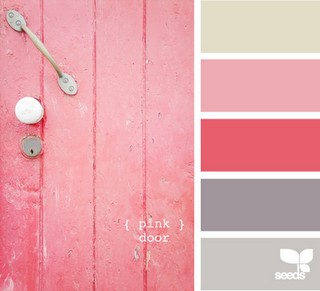
I need help, however, with color schemes. And that’s where you come in. I’m planning on painting the walls dark grey and painting the stencil pattern with light grey. What I need is an accent color( think: colors of flowers, colors of art, colors of window treatments), otherwise I’ll stick with grey & white and that can be a little boring.
What do you like best?
1.
2.

3.
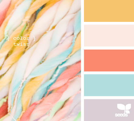
4.

Comment below and let me know which is your favorite! Your help will be greatly, greatly appreciated!
Thanks lovely readers!

comments
Congratulations on your new studio! I like the first color scheme the best. Love the greys and pinks 🙂 Can’t wait to see what you decide!
I also love all your hair tutorials especially since I have shorter hair. They are hard to find and yours are all amazing. Thanks so much 🙂
-Holly @ Eight Six Eleven
I love them all, but the second one is just gorgeous!
While I really like grey and coral, I think grey and pink is sophisticated, professional, and would look gorgeous with the floors and cabinets! Plus, who doesn’t love shopping for pink flowers, pink curtains, and pink art?!
I love the color options! I would pick #2 flora bright. It is has bright “happy” colors and deep colors as well…it will be great through any season! Congrats on your new studio!
Ohhhh how exciting!! We need pictures when you are done 🙂
I think Flora bright is my favorite ~
Have fun!
I like option #2: the depth and richness of the colors seem to convey the “spunk” that you have! The muted shades would seem appropriate for… less spunk. 🙂 All are beautiful, though.
I love the first one!
Congrats on the studio! I like #2 the best, but they’re all very pretty. 🙂
Option #3 looks the most appealing to me.
I like flora bright… the bright pops of color will balance out the grey and dark hardwoods. Fun!
And I have been styling the bouncy curled under lately… and never have received so many compliments on my hair! THANKS!
I LOVE 1 & 3 ! There not to overwhelming of colors and I think they would be great accent colors! Congrats & Good Luck!! 🙂
Four, four, four, four, four, four, four! But include the idea on the first on of the pink door.
http://www.luxeboulevard.blogspot.com
#1 or #3….love the watermelon color, but you know, I’m partial to
yellow and grey. I think the darker grey wall with the light grey stencil
will be beautiful. Wish I were there with you to help! 🙁
Oh boy. Tough decision. Why did you pick 4 good ones?! haha I am really diggin’ #3. Be sure to pick something you won’t get sick of though and maybe shop around first, and make sure you can find enough accessories in you color palette. Good luck! Either way I am sure it will look awesome!
I like #2 the best. I just found your blog and love your tutorials, thanks! I just realized that you are in Raleigh, I live in Chapel Hill and NEED a new hair stylist. Any chance you could let me know how to make an appt. with you?
Jbear: send me an email at itsthesmallthingsblog@gmail.com and I’ll give you my information! 🙂
I like 1 &2 but I think 1 is timeless and would be the most appealing long term. However I know it will look amazing no matter which color scheme you choose. You have a way of making everything sophisticated and beautiful. Can’t wait to see it!
I like the last one. I like the deeper colors, I think they’re very rich. I cannot wait to see the new place! Too bad I’m growing my hair out, or I’d try to be the first to patronize the new studio!
Congratulations! How exciting! I personally like #2 the best but #1 is a close second!
how fun!!
i really like #2 🙂
Either number 1 or 2!! Congrats Kate!
I love the coral in the #3 pallette. It’s very soothing and calming…something I need when making hair decisions!! Tho’, I’m sure whatever you decide will be beautiful. Have fun 🙂
I like muted purple and gray 🙂 l did it in my apt.
Dorothy
I think you could do alot with the 2nd one! I’ve been seeing similar colors in a lot of shops lately so finding some darling accessories for your studio wouldn’t be to difficult. And pretty!
Congrats on the new studio!
Annika
A Sweet Release
Congratulations for your new studio! I love the tone of the pink door. I think it’ll look light and airy with that big window?
#2 or 3 I think. I love the grey, yellow and coral in 3, but it’s a very summery combo. I think 2 is bold and vibrant and would suit any time of the year. Furniture in the rich amethyst, teal or olive shades with the grey walls would be fantastic!
2 all the way. Just found your blog about a week ago and love it! Keep the tutorials coming!
The Flora Bright and Sweet Shop hues are both so pretty. I especially love plum and aqua with grey, the aqua has good ‘pop’ and the plum keeps it balanced and still colorful.
Congrats on the new studio! New follower here. LOVE your blog! 🙂
My vote is for #2. Love those bright colors. Fresh, sweet and up-to-date.
How exciting – it’s so important to enjoy your working space!
I like #2 the best!! Can’t wait to see the “after” pics!
I like all of them, but I prefer 3 I think. I just painted 4 rooms in my house, and I definitely learned that a color that looks light on a swatch can look MUCH brighter on your walls. I find that colors that look fun and bright on swatches can be extremely overwhelming and/or too bright when painted on a wall. That’s just my advice as a recent painter! I’m sure anything you choose will look great:]
I just found your blog a week or so ago and I went back and read every post! I love that you show us non-pros how to style our hair!!
As for the new salon(congrats!) I love the first scheme. Those colors are flattering to everyone and it feels feminine without being over the top!
Congrats on the new studio. It was a hard choice between 2 and 4 for me. I really like the yellow and gray and light blue in #4…mixed with the other colors. I’m sure whatever you end up choosing will look fabulous…you have great style!
Love #1! It’s the most classic, least trendy.
Congratulations! I like Sweet Shop!
I love #2 and #3 best!
I like #1 best. I agree with the comment above that it’s classic and doesn’t look too trendy.
Love the second one, but if the walls are gray, I think #1 would be better.
1 3 or 4. I find that the 2nd is lovely on it’s own, but mixed with the darker cabinets may be a little too much.
Congratulations on your move! I like numbers 1 and 2 even though they’re totally different. My preference would be, if you’re going to spend the whole day there, number 1. It has a more calming affect and that lends itself to more creativity. Good luck – can’t wait to see it!
Congratulations Kate! My vote is for Flora bright.
I love both #1 AND #3, but if I had to make a choice I would probably lean more towards #3 because I love, love, love coral. I also think having these colors in your salon might be more flattering on skintones. Whatever you choose will look great!
#2. I love the teal and it’s still girly without being too girly.
I love #3! It’s the color palate of my dream house!
http://www.birdyslist.blogspot.com
Hi, new follower here courtesy of Pinterest! 🙂 I’d go for number 4 although they are all lovely. Congrats on the new studio from a fellow Carolinian!
Four! The colors are calming and more classy. Just my opinion!
Love #1 with the pink and gray. Although, I had a very light lavender and gray for my wedding colors, so I love that combination as well.
I vote for #4. I LOVE gray and yellow together and have been trying to incorporate that into my home lately because there are so many beautiful pillows and decorative accents I keep finding in that color scheme. Also the aqua color is beautiful.
Congrats on the new studio space, i love #3!
Congrats! I love #2!!
I love number 3–soothing, comfortable colors.
Love your blog!
I really like option 1 or 2 equally!
love #1
I love, love, LOVE #3! So warm and inviting, but not overpowering.
I like #2 – how exciting – congrats!
TWO!!
I love #2! The colors are so bright and vibrant, I’d love to look at them while getting my hair done.
eeek I’m having a hard time choosing between #1 and #3! Congrats on moving to the new studio 🙂 I’m a new follower and I love your blog and your hair lol 😉
Are the majority of your clients female? Do you have a large male client base? If so, you might consider a less girly/frilly accent color and go with 3 or 4. Just a thought.
the second one!
{2}
The second one with the last one in a close second.
I like #1 I Love the darker colors of #2 but I think they would be to dark for a salon.
i like #2. a good combo of light and dark colors
I love number 1- it just says “Happy”!
you are so cute. I just bought your flat iron in a bottle- trying to grow out my hair- from an all one length bob to something longer and possibly a few layers. love your hair….
#2 for sure! Those are my wedding colors (pinks and tiffany blue), they go so well together and are so fun!!
Number 2, number 2!!! :o)
I like the flora color scheme best
I like color twist best and sweet shop second 🙂 You’ll have an easier time w/ decorating w/ more colors.
I would have to say number one and number three. As a fellow hairstylist, those SCREAM salon!! Good luck!
4 is my fave… it’s soothing. 1 is my next fave… it’s feminine fun.
(all our great choices, though)
2 and 3 but I really think 3 would be gorgeous.
#1 is my favorite!!! I don’t think you can go wrong with any of them, though:)
#2 is the BEST!
I like the first one myself. Congrats on the new salon!!!
I am a bit late here…but first of all congrats on the new space. My color choices would be #4 and then #1.
Love the 1st one!:)
I love the 3rd one!
i LOVE the second one!
definitly the second one
Best of luck Kate, I pray blessings for you as you start this exciting new journey! I like number 3
Number 2.
#1
# 3 or #1, in that order. Can’t wait to see the new place. Congratulations!!!
I really like #2 .. where can I find these colors?
I really like #2 .. where can I find these colors?
This is because this device assures to either benefit or cure the autistic people
in more ways than one. These pre-computed numbers, hold on in a very giant information bank for millions
or URLs on the net. And then on March 20, the world’s largest paid private blog network – BMR – announced that
its vast network had been almost entirely de-indexed by
Google, causing chaos in the internet marketing industries.